Lorem ipsum dolor sit amet, consectetur adipisicing elit, sed do eiusmod tempor incididunt ut labore et dolore magna aliqua. Ut …
In Read Article Posted August 24, 2016
In Read Article Posted August 24, 2016
In Philosophy, SxSW, Usability, User Experience, Web Design Posted March 15, 2012
In SxSW, Web Design Posted March 15, 2012
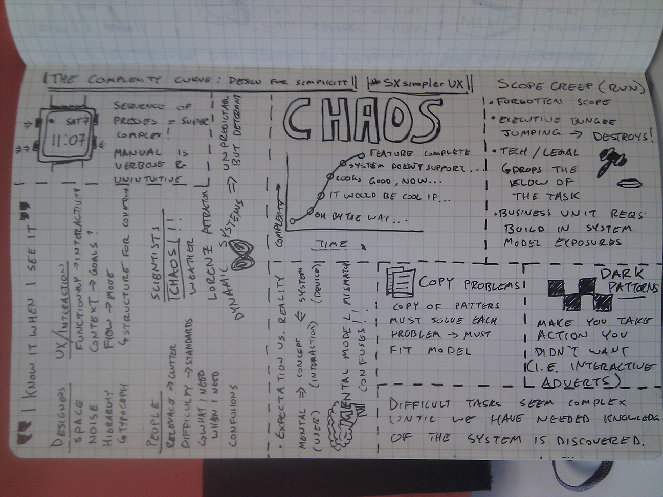
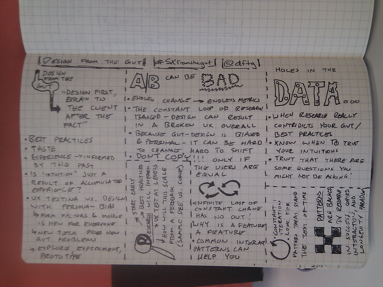
In Interaction Design, SxSW, User Experience, Web Design Posted March 15, 2012
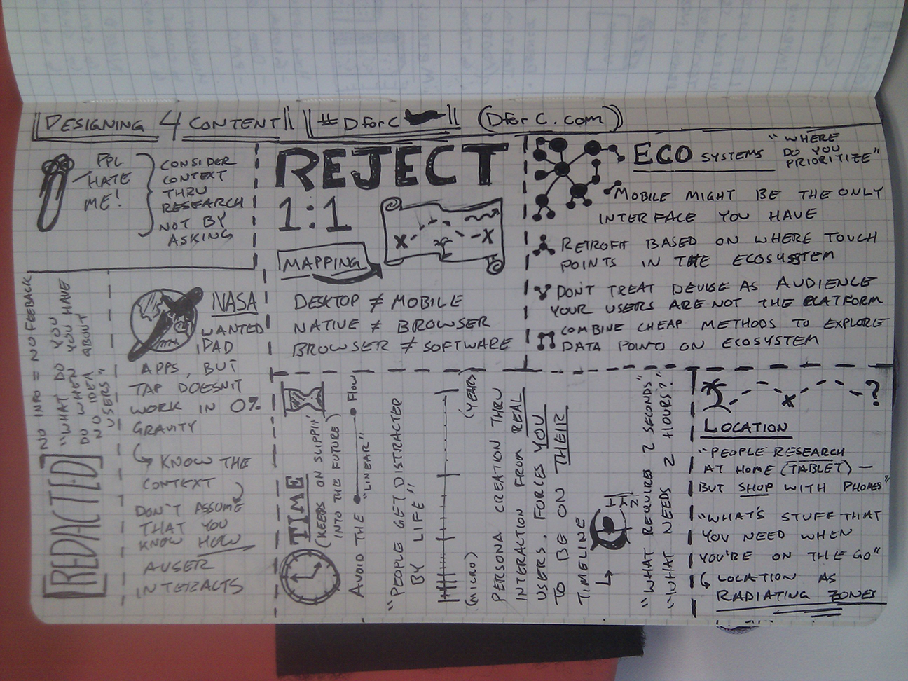
In Accessibility, Information Architecture, Usability, User Experience, Web Design Posted August 23, 2011