In Accessibility, Interaction Design, Mobile, Usability, User Experience, Web Design Posted February 15, 2013
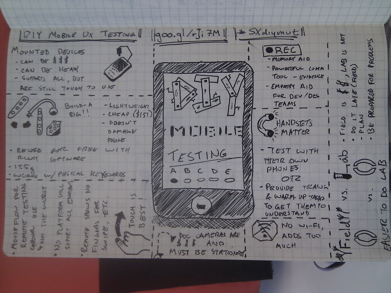
In Accessibility, Mobile, SxSW, Usability, User Experience Posted March 20, 2012
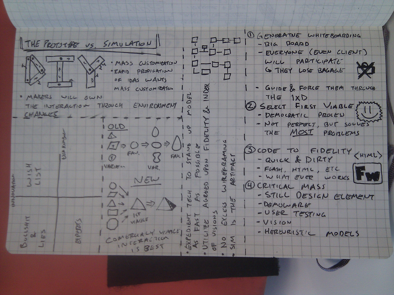
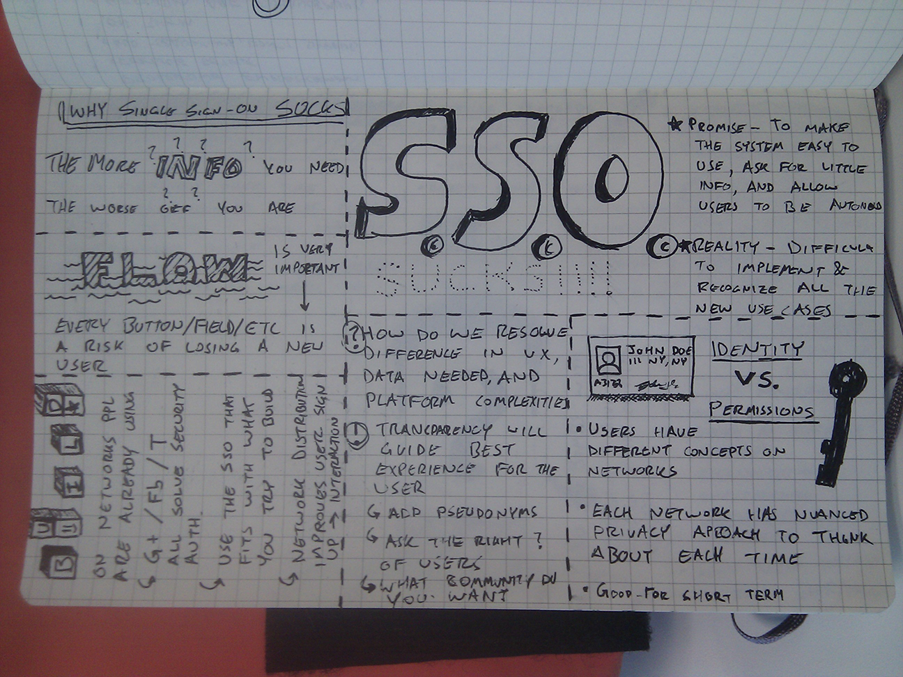
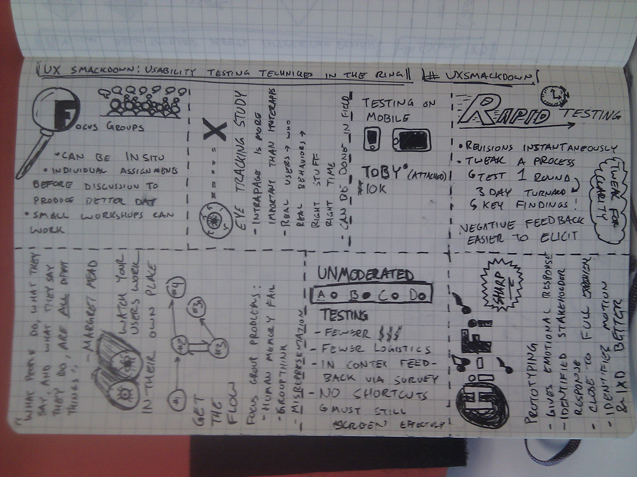
In Interaction Design, Money, SxSW, Usability, User Experience Posted March 16, 2012
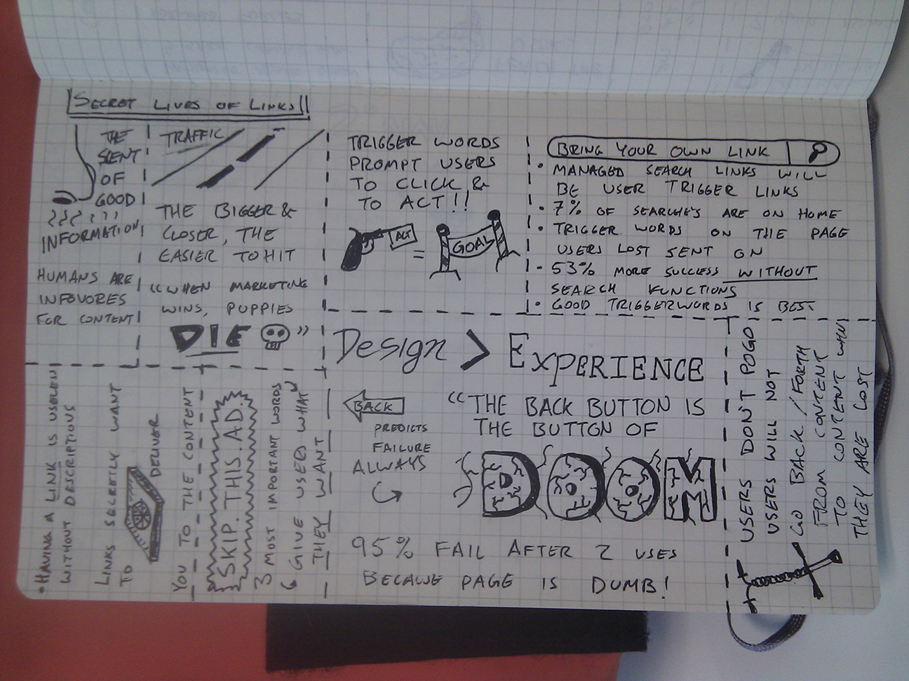
In Information Architecture, Interaction Design, Philosophy, SxSW, Usability Posted March 16, 2012
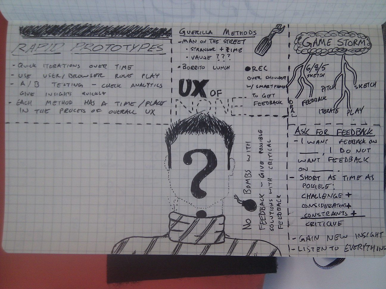
In SxSW, Usability, User Experience Posted March 15, 2012
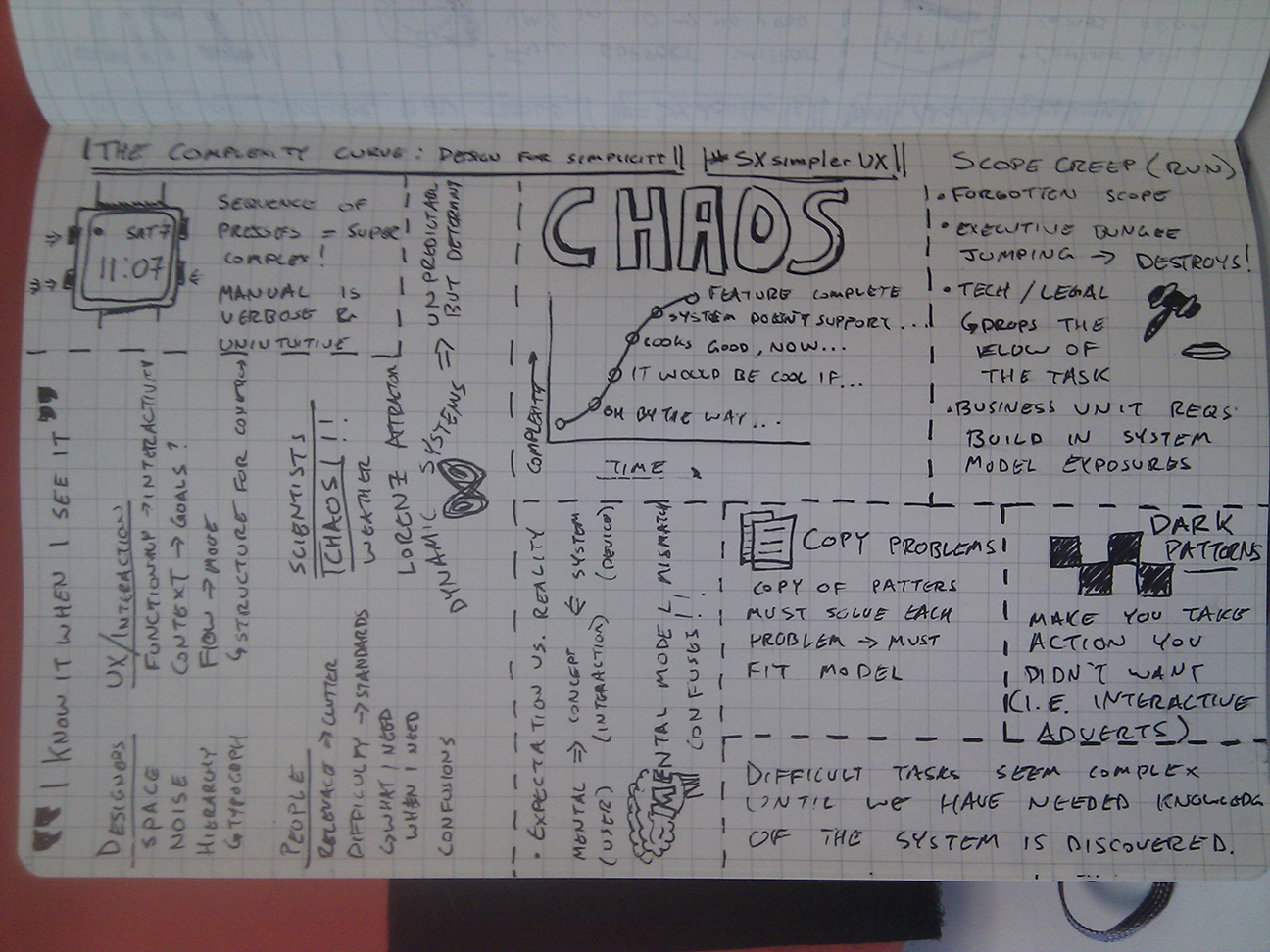
In Philosophy, SxSW, Usability Posted March 15, 2012
In Philosophy, SxSW, Usability, User Experience, Web Design Posted March 15, 2012
In Accessibility, Information Architecture, Usability, User Experience, Web Design Posted August 23, 2011